When optimizing a site for user experience, it is important to keep in mind these basic best practices to increase your conversion rate:
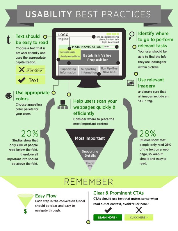
1.) Any professional web design team will tell you to make sure that the text should be easy to read and browser-friendly. Even though the fancy fonts may look cool, they are going to be hard to read and deter the user from reading your content.
2. Your navigation should clearly identity where the user needs to go to perform relevant tasks. Keep in mind that it should take a minimum of three clicks for the user to find what they are looking for.
3. Make sure you are using colors that reinforce your brand identity. Choose colors that are both appealing and appropriate.
4. Help users scan your webpages quickly and efficiently by placing the most important information up top followed by supporting details and ending with any related info.
5. Keep in mind that each step in your conversion funnel should be clear and easy to navigate.
6. All Calls to Action should be clear and prominent. Avoid using phrases such as “click here” that wouldn’t make sense when read out of context. Instead, use action words such as “Learn More” Buy Now” “Sign up”.
Following this checklist when creating a site will a ensure a positive user experience and will likely lead to an increase in your conversion rate.